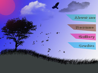
Today I have created a sketch out of my next flash assignment. At the first time, I Created its background on photoshop with yellow background. However, I realized that yellow background make my flash seems to be boring, so I decided to change it into blue and this time it looks better when the viewer watch it, It really makes the viewers feel that it is interesting. The color of buttons also forward the viewer to the contents of viewer.

No comments:
Post a Comment