Sunday, December 21, 2008
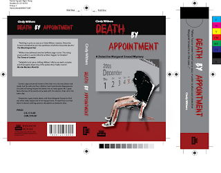
A view of my book cover and bookmark design(Wk9_1)
In this week I designed a book cover and bookmark for my assignment. This is an interesting assignment because it helps us know how to design a book cover and a bookmark practically. Basically, my design based on white, gray, and specially bold red for blood due to this is a book of a mysterious story. The center point of my design is a died girl on the chair. This image I took it from my friend and used basic skill on photoshop to get her picture in threshold. The most interesting thing is that the knife on her hand and blood on it was made by me with only gaussian blur effect of photoshop. Finally, I looked at margin of my design mostly to follow the rules of gestalt and all of text in my design were arranged into same lanes.

Subscribe to:
Post Comments (Atom)

No comments:
Post a Comment