Sunday, November 30, 2008
Let's protect environment....(Wk6_2)
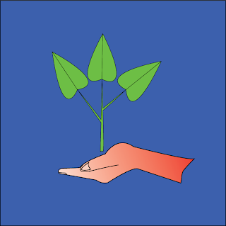
Today on many electronic devices we may find many different marks of standard like CE(Europe standard) , UL (US standard).... but we rarely see any mark of protecting environment mark. I have found only protecting environment marks on refrigerator and air conditioner of LG and Sanyo products, so I had an idea to design a simple mark of protecting environment which was created of green leaves for good protection of forest, blue for fresh air and water, human hand for consciousness of people on protection of environment.
Simple but easy to realize(Wk6_1)
On the last Saturday when walking on the street I found many traffic guide boards with simple design of lines and shapes. Therefore, I had an idea: why don't I modify it to make it look more interesting? My modified design of boards look very simple with blue background and white for objects. I think that if these boards applied on the streets they may make the streets look more interesting.
Sunday, November 23, 2008
Design a letter(Wk5_2)
In the previous week Miss Tuyet gave me a letter "C" . At the first time I had no idea to design it but after looking at some letter designs I got an Idea: design different types of "C" letter to use it for different purposes: the first and the last one could be used on advertising because it has decorations at corners, the second one could be used for labels of commercial products like sweet or toys. the third one is suitable for technical drawing only like drawings of machines or charts (diagrams) because it is clearly to be recognized.
How to make a dynamic image from an usual image(Wk5_1)
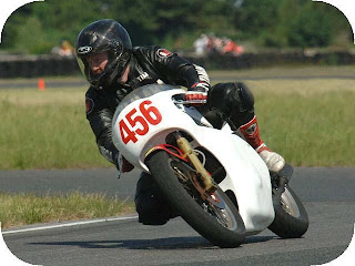
Photoshop is a powerful software to help us add and adjust effects on our original photo to a splendid photo. today I want to introduce the most easiest way on photoshop to adjust a normal photo to a photo with motion inside. Firstly, let's choose a motorman for my example:
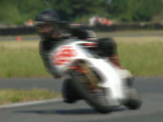
After choosing an image, I used stamp tool (S) and Healing brush tool (J) to clone the corners to make it looks like a normal photo. Next, I used polygonal lasso tool (L) to choose the whole motorman. In next step I choose filter\blur\motion blur and adjust to about 3. That's all for motorman. However, the background looks like a static scene, so I choose select\inverse (or Ctrl+Shift+I) and after that choose filter\blur\gaussian blur and adjust to 2.8. Here is the result:
Sunday, November 16, 2008
Easiest way to protect and decorate your electronic things(Wk4_2)
In Ho Chi Minh city people can find many places where they can cover their mobile phones and laptops with labels. This is really convenient because label can protect your mobile phones and laptops against scratches. This service is quite cheap, about 10,000VNĐ for a mobile phone and 30,000VNĐ for a laptop. Let's have a look at my little sister's laptop after labeled.
Blends on photoshop (Wk4_1)
Photoshop has many interesting functions. One of them is brush. I really love to use brush because it really saves time for us to make complicated images and effects with least time. Brushes can be downloaded easily from internet at some design forums like DevianArt. After downloading it, you must open "Brush window" in Photoshop and then choose your brushes which had been downloaded before and drag them to the "Brush window". That is the easiest way to install a mass of brushes at the same time. in order to make bland, the most important thing is that you must take care of color brightness and contrast. this is very important because if you do it carelessly, people ca realize the contour of object which is manipulated.
Sunday, November 9, 2008
Make effects for photos without Photoshop(Wk3_2)
Today I want to introduce to everybody a software named vvphoto version 1.8 to make effects on photo like sepia, old photos... and one of the most special effects of this software is that it can make a photo looks like pencil drawing. But actually it makes only photo looks like pencil drawing , it can not be as well as original pencil drawing. I hope with this software people can make some interesting photos with only two easy steps: import the photo and choose effect and than choose which effect that they want :). Easy to make old photos. Here are some examples of old photos that I made:
Friday, November 7, 2008
Using mask and threshold in Photoshop(Wk3_1)
Mask is used widely in photoshop in order to hide things which we do not want to show on our art work. In the past I wondered how can I merge different areas of 2 different layers. It was so difficult for me to merge good areas of two layers until I studied how to use mask. In order to make mask for our work we must have at least 2 layers. For example, if we want to adjust an image , the first thing we have to do is that copy our image to a new layer or we can use shortcut key Ctrl+J. After that we wiil tick off "eye icon" of layer which we want to hide. After adjusting the first layer, we move to adjust the second layer by ticking on "eye icon" of second layer and tick off the first one. However, we found that each layer has its good and bad things. In order to get good things of second layer we must use "mask" . In order to make mask, we must choose the upper layer(in this case is the first layer) and choose making mask icon ( making mask icon looks like a circle inside a rectangle on layer work area. After that we choose brush tool and choose black color and choose mask layer we have made. As we brush the lower layer will appear. Therefore, we can merge good things of first and second layer.
The original photo:
The original photo:
Sunday, November 2, 2008
typing...typing things(Wk2_2)
Today I had mood to make different composes of things based on typing which I studied in semester 1. This is an interesting work in which I can imagine and make different things that I want.Basically, I made my typing work by keeping original ratio of letters without scale. I just adjusted the size of letters and it was really difficult for me to keep it fit to the ratio of things which I intended to create.
Saturday, November 1, 2008
Gestalt - basic tools for design(Wk2_1)
After studying gestalt theory and how to use it effectively for my design work, I found that in the past I made a lot of ineffective design because I did not know how to make a good feel to the viewers. The problem was that I could not make the viewers focus to my design due to my bad gestalt. However, after studying gestalt with different kinds of closure, continuance, similarity, proximity, alignment I found that if I know good about these concepts I can make my works better. I have tried one of them -continuance in my exercise with a background of snow flower and another background of vinca under the body text. I think that both background are about flowers and they are suitable for the content of body text. Moreover, the background of body text is darker than the main background will make the viewers focus mostly on the body text.
Subscribe to:
Posts (Atom)